| MATLAB Functions | Help Desk |
uicontrol
Create user interface control object.handle = uicontrol(parent) handle = uicontrol(...,'PropertyName',PropertyValue,...)
uicontrol is the function for creating Uicontrol graphics objects. Uicontrols (user interface controls) implement graphical user interfaces. When selected, most Uicontrol objects perform a predefined action. MATLAB supports nine styles of Uicontrols, each of which is suited for a different purpose:
Callback. Use editable text when you want text as input.
Static text are boxes that display lines of text. It is typically used to label a group of other controls, provide directions to the user, or indicate values associated with a slider. Users cannot change static text interactively and there is no way to invoke the callback routine associated with it.
Frames are boxes that enclose regions of a figure window. Frames can make a user interface easier to understand by grouping related controls. Frames have no callback routines associated with them.
List boxes display a list of strings and allow users to select individual list entries or multiple, noncontiguous, list entries. The Min and Max properties control this selection mode. The Value property contains the indices into the list of strings. Value is a vector if multiple selections are made. MATLAB evaluates the list box's callback routine after any mouse button up event that changes the Value property. Therefore, you may need to add a "Done" button to delay action caused by multiple clicks on list items.
List boxes differentiate between single and double clicks and set the Figure SelectionType property to normal or open accordingly before evaluating the list box's Callback property.
The uicontrol function accepts property name/property value pairs, structures, and cell arrays as input arguments and optionally returns the handle of the created object. The "Uicontrol Properties" section describes these properties. You can also set and query property values after creating the object using the set and get functions.
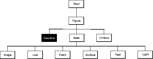
Uicontrol objects are children of Figures and therefore do not require an Axes to exist when being placed in a Figure window.
The following statement creates a push button that clears the current axes when pressed:
h = uicontrol('Style','Pushbutton','Position',...
    [20 150 100 70], 'Callback','cla','String','Clear');
You can create a Uicontrol object that changes Figure colormaps by specifying a pop-up menu and supplying an M-file as the object's Callback:
hpop = uicontrol('Style','Popup','String',...
       'hsv|hot|cool|gray','Position',[20 320 100 50],...
       'Callback','setmap')
This call to uicontrol defines four individual choices in the menu: hsv, hot, cool, and gray. You specify these choices with the String property, separating each with the "|" character.
The Callback, in this case setmap, is the name of an M-file that defines a more complicated set of instructions than a single MATLAB command. setmap contains:
val = get(hpop,'Value');
if val == 1
    colormap(hsv)
elseif val == 2
    colormap(hot)
elseif val == 3
    colormap(cool)
elseif val == 4
    colormap(gray)
end
The Value property contains a number that indicates which choice you selected. The choices are numbered sequentially from one to four. The setmap M-file can get and then test the contents of the Value property to determine what action to take.
 Setting Default Properties
You can set default Uicontrol properties on the Figure and Root levels:
Setting Default Properties
You can set default Uicontrol properties on the Figure and Root levels:
set(0,'DefaultUicontrolProperty',PropertyValue...)
set(gcf,'DefaultUicontrolProperty',PropertyValue...)
Where Property is the name of the Uicontrol property whose default value you want to set and PropertyValue is the value you are specifying.
This section lists property names along with the type of values each accepts. Curly braces { } enclose default values.
BackgroundColor ColorSpec
Object background color. The color used to fill the rectangle defined by the Uicontrol. Specify a color using a three-element RGB vector or one of MATLAB's predefined names. The default color is light gray. See the ColorSpec reference page for more information on specifying color.
BusyAction cancel | {queue}
Callback routine interruption. The BusyAction property enables you to control how MATLAB handles events that potentially interrupt executing callback routines. If there is a callback routine executing, subsequently invoked callback routes always attempt to interrupt it. If the Interruptible property of the object whose callback is executing is set to on (the default), then interruption occurs at the next point where the event queue is processed. If the Interruptible property is off, the BusyAction property (of the object owning the executing callback) determines how MATLAB handles the event. The choices are:
cancel - discard the event that attempted to execute a second callback routine.
queue - queue the event that attempted to execute a second callback routine until the current callback finishes.
ButtonDownFcn string
Button press callback routine. A callback routine that executes whenever you press a mouse button while the pointer is in a five-pixel wide border around the Uicontrol. When the Uicontrol's Enable property is set to inactive or off, the ButtonDownFcn executes when you click the mouse in the five-pixel border or on the control itself. This is useful for implementing actions to interactively modify control object properties, such as size and position, when they are clicked on (using selectmoveresize, for example).
Callback property defines the callback routine that executes when you activate the enabled Uicontrol (e.g., click on a push button).
Callback stringControl action. A callback routine that executes whenever you activate the Uicontrol object (e.g., when you click on a push button or move a slider). Define this routine as a string that is a valid MATLAB expression or the name of an M-file. The expression executes in the MATLAB workspace. Note that Frames and Static Text do not define actions to interactively invoke their callback routines.
Children matrixThe empty matrix; Uicontrol objects have no children.
Clipping {on} | offThis property has no effect on Uicontrols.
CreateFcn stringCallback routine executed during object creation. This property defines a callback routine that executes when MATLAB creates a Uicontrol object. You must define this property as a default value for Uicontrols. For example, the statement,
set(0,'DefaultUicontrolCreateFcn','set(gcf,''IntegerHandle'',''o
ff'')')
defines a default value on the Root level that sets the Figure
IntegerHandle property to off whenever you create a Uicontrol object. MATLAB executes this routine after setting all property values for the Uicontrol. Setting this property on an existing Uicontrol object has no effect.
DeleteFcn string
Delete Uicontrol callback routine. A callback routine that executes when you delete the Uicontrol object (e.g., when you issue a delete command or clear the Figure containing the Uicontrol). MATLAB executes the routine before destroying the object's properties so these values are available to the callback routine.
Enable {on} | inactive | offEnable or disable the Uicontrol. This property controls how Uicontrols respond to mouse button clicks.
on - The Uicontrol is operational. When you activate the Uicontrol (generally by clicking on it) MATLAB executes the callback routine defined by the Callback property. When you click the mouse within a 5-pixel border outside the Uicontrol, MATLAB executes the callback routine defined by the ButtonDownFcn.
inactive - The Uicontrol is not operational, but it is not dimmed (i.e., it looks the same as when Enable is on). MATLAB executes the ButtonDownFcn if you click the mouse on or within a 5-pixel border around the Uicontrol, and does not execute the Callback.
off - The Uicontrol does not respond visually to mouse actions, does not execute its Callback routine, and its label (string property) is grayed out. MATLAB executes the ButtonDownFcn if you click the mouse on or within a 5-pixel border around the Uicontrol.
inactive or off enables you to implement object "dragging" via the ButtonDownFcn callback routine.
Extent position rectangle (read only)Size of Uicontrol character string. A four-element vector that defines the size and position of the character string used to label the Uicontrol. It has the form:
[0,0,width,height]
width and height are the dimensions of the rectangle. All measurements are in units specified by the Units property.
Since the Extent property is defined in the same units as the Uicontrol itself, you can use this property to determine proper sizing for the Uicontrol with regard to its label. Do this by,
String property and selecting the font using the Fontnnn properties.
Extent property.
width and height of the Position property to be somewhat larger than the width and height of the Extent.
Extent rectangle encompasses all the lines of text. For single line strings, the Extent is returned as a single line, even if the string wraps when displayed on the control.
FontAngle {normal} | italic | oblique
Character slant. MATLAB uses this property to select a font from those available on your particular system. Setting this property to italic or oblique selects a slanted version of the font, when it is available on your system.
FontName stringFont family. The name of the font in which to display the String. To display and print properly, this must be a font that your system supports. The default font is system dependent.
FontSize size in FontUnits
Font size. A number specifying the size of the font in which to display the String, in units determined by the FontUnits property. The default point size is system dependent.
FontUnits {points} | normalized | inches | centimeters |
pixels
Font size units. MATLAB uses this property to determine the units used by the FontSize property. Normalized units interpret FontSize as a fraction of the height of the Uicontrol. When you resize the Uicontrol, MATLAB modifies the screen FontSize accordingly. pixels, inches, centimeters, and points are absolute units (1 point = 1/72 inch).
FontWeight light | {normal} | demi | bold
Weight of Text characters. MATLAB uses this property to select a font from those available on your particular system. Setting this property to bold causes MATLAB to use a bold version of the font, when it is available on your system.
ForegroundColor ColorSpec
Color of text. This property determines the color of the text defined for the String property (the Uicontrol label). Specify a color using a three-element RGB vector or one of MATLAB's predefined names. The default text color is black. See the ColorSpec reference page for more information on specifying color.
HandleVisibility {on} | callback | off
Control access to object's handle by command-line users and GUIs. This property determines when an object's handle is visible in its parent's list of children. Handles are always visible when HandleVisibility is on. When HandleVisibility is callback, handles are visible from within callbacks or functions invoked by callbacks, but not from within functions invoked from the command line - a useful way to protect GUIs from command-line users, while permitting their callbacks complete access to their own handles. Setting HandleVisibility to off makes handles invisible at all times - which is occasionally necessary when a callback needs to invoke a function that might potentially damage the UI, and so wants to temporarily hide its own handles during the execution of that function.
callback or off, the object's handle does not appear in its parent's Children property, Figures do not appear in the Root's CurrentFigure property, objects do not appear in the Root's CallbackObject property or in the Figure's CurrentObject property, and Axes do not appear in their parent's CurrentAxes property.
The Root ShowHiddenHandles property can be set to on to temporarily make all handles visible, regardless of their HandleVisibility settings (this does not affect the values of the HandleVisibility properties).
Handles that are hidden are still valid. If you know an object's handle, you can set and get its properties, and pass it to any function that operates on handles. This property is useful for preventing command-line users from accidently drawing into or deleting a Figure that contains only user interface devices (such as a dialog box).
HorizontalAlignment left | {center} | right
Horizontal alignment of label string. This property determines the justification of the text defined for the String property (the Uicontrol label):
left -- Text is left justified with respect to the Uicontrol.
center -- Text is centered with respect to the Uicontrol.
right -- Text is right justified with respect to the Uicontrol.
edit and text Uicontrols.
Interruptible {on} | off
Callback routine interruption mode. The Interruptible property controls whether a Uicontrol callback routine can be interrupted by subsequently invoked callback routines. By default (off), a callback routine executes to completion before another can begin.
ButtonDownFcn and Callback properties are affected by the Interruptible property. MATLAB checks for events that can interrupt a callback routine only when it encounters a drawnow, figure, getframe, or pause command in the routine.
ListboxTop scalar
Index of top-most string displayed in list box. This property applies only to the listbox style of Uicontrol. It specifies which string occupies the top-most position in the list box. Define ListboxTop as an index into the array of strings defined by the String property. Noninteger values are fixed to the next lowest integer.
Max scalar
Maximum value. This property specifies the largest value allowed for the Value property. Different Styles of Uicontrols interpret Max differently:
Max is the setting of the Value property while the Uicontrol is in the on position.
Max is the largest value you can select and must be greater than the Min property. The default maximum is 1.
Max - Min > 1, then editable text boxes accept multiline input. If Max - Min <= 1, then editable text boxes accept only single line input.
Max - Min > 1, then list boxes allow multiple item selection. If Max - Min <= 1, then list boxes do not allow multiple item selection.
Max property.
Min scalar
Minimum value. This property specifies the smallest value allowed for the Value property. Different Styles of Uicontrols interpret Min differently:
Min is the setting of the Value property while the Uicontrol is in the off position.
Min is the smallest value you can select and must be less than Max. The default minimum is 0.
Max - Min > 1, then editable text boxes accept multiline input. If Max - Min <= 1, then editable text boxes accept only single line input.
Max - Min > 1, then list boxes allow multiple item selection. If Max - Min <= 1, then list boxes allow only single item selection.
Parent handle Uicontrol's parent. The handle of the Uicontrol's parent object. The parent of a Uicontrol object is the Figure in which it displays. You can move a Uicontrol object to another Figure by setting this property to the handle of the new parent.
Position position rectangle
Size and location of Uicontrol. The rectangle defined by this property specifies the size and location of the control within the Figure window. Specify Position as
[left,bottom,width,height]
left and bottom are the distance from the lower-left corner of the Figure window to the lower-left corner of the Uicontrol object. width and height are the dimensions of the Uicontrol rectangle. All measurements are in units specified by the Units property.
Selected on | {off}
Is object selected. When this property is on, MATLAB displays selection handles if the SelectionHighlight property is also on. You can, for example, define the ButtonDownFcn to set this property, allowing users to select the object with the mouse.
SelectionHighlight {on} | off
Objects highlight when selected. When the Selected property is on, MATLAB indicates the selected state by drawing four edge handles and four corner handles. When SelectionHighlight is off, MATLAB does not draw the handles.
SliderStep [min_step max_step]
Slider step size. This property controls the percentage (of maximum slider value) change in the slider's current value when you click the mouse on the slider trough (max_step) or on its arrow button (min_step). Specify SliderStep as a two-element vector whose elements MATLAB converts to percents. The default, [0.01 0.10], provides a 1 percent change for clicks on the arrow button and a 10 percent change for clicks in the trough.
String stringUicontrol label. A string specifying the text displayed on push buttons, radio buttons, check boxes, static text, editable text, listboxes, and pop-up menus.
For multiple items on a pop-up menu or a list box, items can be specified as a cell array of strings, a padded string matrix, or within a string vector separated by vertical slash (`|') characters. For multiple line editable text or static text controls, line breaks occur between each row of the string matrix, each cell of a cell array of strings, and after any\n characters embedded in the string. Vertical slash (`|') characters are not interpreted as linebreaks, and instead show up in the text displayed in the uicontrol.
For the remaining uicontrol styles, which display only one line of text, only the first string of a cell array of string or of a padded string matrix is displayed, and all the rest are ignored. Vertical slash (`|') characters are not interpreted as linebreaks, and instead show up in the text displayed in the uicontrol.
For editable text, this property is set to the string typed in by the user.
Style {pushbutton} | radiobutton | checkbox | edit |
text | slider | frame | listbox | popupmenu
Style of Uicontrol object to create. The Style property selects the style of Uicontrol to create. See the "Description" section for information on each type.
Tag string
User-specified object label. The Tag property provides a means to identify graphics objects with a user-specified label. This is particularly useful when constructing interactive graphics programs that would otherwise need to define object handles as global variables or pass them as arguments between callback routines. You can define Tag as any string.
Type string (read only)
Class of graphics object. For Uicontrol objects, Type is always the string 'uicontrol'.
Units {pixels} | normalized | inches | centimeters |
points
Units of measurement. The units MATLAB uses to interpret the Extent and Position properties. All units are measured from the lower-left corner of the Figure window. Normalized units map the lower-left corner of the Figure window to (0,0) and the upper-right corner to (1.0,1.0). pixels, inches, centimeters, and points are absolute units (1 point = 1/72 inch).
Units, it is good practice to return it to its default value after completing your computation so as not to affect other functions that assume Units is set to the default value.
UserData matrix
User-specified data. Any data you want to associate with the Uicontrol object. MATLAB does not use this data, but you can access it using set and get.
Value scalar or vector
Current value of Uicontrol. The possible values a Uicontrol can take on depend on its Style property:
Value to Max (usually 1) when they are on (when the indicator is filled) and Min (usually 0) when off (not filled).
Value to the number indicated by the slider bar, which is within the range established by Min and Max.
Value to the index of the item selected, where 1 corresponds to the first item on the menu. The "Examples" section shows how to use the Value property to determine which item has been selected.
Value to a vector of indices corresponding to the highlighted items displayed in the box, where 1 corresponds to the first item in the list.
Value property either interactively with the mouse or through a call to the set function. The display reflects changes made to Value.
Visible {on} | off
Uicontrol visibility. By default, all Uicontrols are visible. When set to off, the Uicontrol is not visible, but still exists and you can query and set its properties.
textwrap, uimenu